Create a Professional Website: HTML & CSS For Beginners
Oct 13, 2023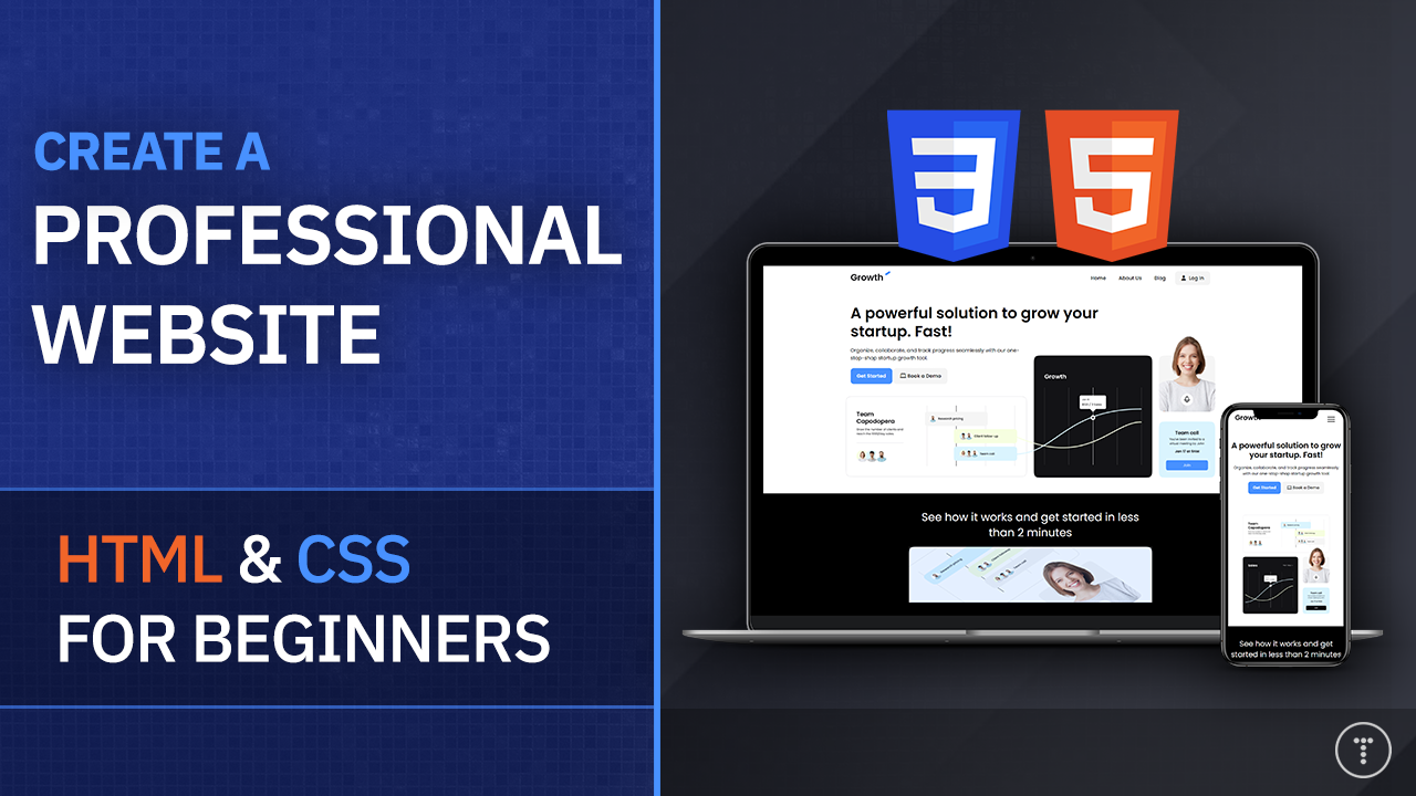
HTML and CSS are the fundamental building blocks of the web. They're almost always the first thing you learn when becoming a front-end or full-stack web developer. In this tutorial, we'll be creating a simple, professional website using HTML and CSS that we deploy to Netlify. I'm going to take you from just having a Figma file, which is just the layout design, to creating a full-blown responsive webpage. The project itself is a bit advanced for beginners, however, I'm going to explain absolutely everything to the best of my abilities and we'll talk about things like layout, naming conventions, and so on. So this will be a relatively long project. So grab some tea or a cup of coffee and let's build a website.
You can find the video version of this tutorial here.
The Project
The project that we will be building is actually from a website called iCodeThis, which is a new daily coding challenge website, run by my buddy Florin Pop. It's full of UI challenges using HTML, CSS as well as JavaScript, and I thought it would be a great place to find a project for this tutorial. This is one of the larger projects, but if you're fairly new to HTML and CSS, there are a ton of smaller UI projects that you can try out. There are free and paid challenges. They have a fully functional in-browser IDE that is very similar to VS Code. So it's something you may want to check out. For a limited time, you can use the code BRAD to get 10% off.

So the project we'll be doing is called Growth Landing Page. It is a website for a SaaS or "Software as a Service" company. I thought this was a good project because it's not super hard, beginners can follow it, and it's not super easy either. It's a good middle ground. This is one of the pro projects, however, I got permission to share the Figma file with you guys. Figma is a very popular design tool. It runs in the browser and it's free. So you can follow along with the design and you can also download the Figma file here and use it as a reference.
This will not be a pixel-perfect copy of the design. I'm going to make some changes to make it a little bit easier to build. We are also only doing the front landing page. If you want to do some inner pages, that is up to you. Once we get the main layout, adding inner pages is easy.
Let's look at the main sections that we will be creating:
- Navbar: The navbar will include a logo and a menu with links. The login link will be styled as a button. We will create some button utility classes to make it easy to style buttons. We will use flexbox to align the logo and menu along with the links in the menu.
- Hero: The main hero or showcase section will have a large heading, sub-heading, two buttons and some images related to this fictional platform. We could do this in multiple ways. We could slice out each image and put them inline, but since we don't need to interact with the images at all, we can just create one image and use it as a background image. We will also use our button classes here.
- Video Section: We have a simple video section with a thumbnail and a play icon along with another button.
- Testimonials: The testimonials section will have a heading and some cards with some text. We'll use CSS Grid to align these. -Pricing: The pricing section will have two boxes. One for the simple free plan and one for the premium plan. There is a small header and footer to this section as well.
- FAQ: The FAQ section will have a heading and some questions and answers. We are going to use a little bit of JavaScript to toggle the answers.
- Footer: The footer will have a logo, some links and a newsletter signup form.
- Hamburger Menu & Mobile Nav: We will have an icon on smaller screens that will slide open a menu on the right. We will be writing a bit of JavaScript for this.
Using Figma & Exporting Images
This part of the project is completely optional. If you want to use the Figma file, you can download it https://shismqklzntzxworibfn.supabase.co/storage/v1/object/public/pro-challenges/landing.fig. I will show you how to export images if you want to do it yourself, but you can also just get the already sliced images from the GitHub repo.
If you want to use Figma, you can create a free account at https://www.figma.com. Once you're logged in, you can go to the file menu and choose Open File. You can then choose the file that you downloaded. You can also just drag and drop the file into the browser.

Once you have the file open, you can click on the Layers tab on the left. This will show you all the layers in the design. You can click on any layer to select it. You can also click on the eye icon to hide a layer.
If you want to export an image, you can click on the layer and then click on the "Export" button at the top right. You can then choose the format and size. You can also choose to export all the layers at once.

Whether you slice the images yourself or download them from the GitHub repo, create a new folder on your machine called sass-website and create an images folder inside of that. Put all the images in there.
Start Coding
Once you have the images, open the project folder in your editor or IDE. I am using VS Code, but you can really use anything. If you are using VS Code, I would suggest using the Live Server extension. This will allow you to see your changes live in the browser as you make them.
Create a file in the root called index.html. This will be our main HTML file. We will also create a folder called css with a style.css file. This will be our main CSS file. There will be a bit of JavaScript, so create a folder called js with a main.js file.
Base HTML & CSS
Let's add the basic HTML structure to our index.html file. We will link our CSS file as well as the Poppins font and the Font Awesome library for icons. I also included a favicon. You can use the one I have in the GitHub repo or you can create your own. Finally, we will add the JS file at the bottom of the body.
<!DOCTYPE html>
<html lang="en">
  <head>
    <meta charset="UTF-8" />
    <meta name="viewport" content="width=device-width, initial-scale=1.0" />
    <title>Growth App</title>
    <link rel="preconnect" href="https://fonts.googleapis.com" />
    <link rel="preconnect" href="https://fonts.gstatic.com" crossorigin />
    <link rel="preconnect" href="https://fonts.googleapis.com" />
    <link rel="preconnect" href="https://fonts.gstatic.com" crossorigin />
    <link
      href="https://fonts.googleapis.com/css2?family=Poppins:wght@300;400;600;700&display=swap"
      rel="stylesheet"
    />
    <link
      rel="stylesheet"
      href="https://cdnjs.cloudflare.com/ajax/libs/font-awesome/6.4.2/css/all.min.css"
      integrity="sha512-z3gLpd7yknf1YoNbCzqRKc4qyor8gaKU1qmn+CShxbuBusANI9QpRohGBreCFkKxLhei6S9CQXFEbbKuqLg0DA=="
      crossorigin="anonymous"
      referrerpolicy="no-referrer"
    />
    <link rel="stylesheet" href="css/style.css" />
    <link rel="shortcut icon" href="images/favicon.ico" type="image/x-icon" />
  </head>
  <body>
    <!-- Code here -->

    <script src="js/main.js"> </script>
  </body>
</html>
We are going to build desktop-first and then make it responsive for smaller screens after using media queries. So as we are creating the website, for now, have your browser at around 1200px wide. We will make it responsive later on.
For the base CSS, we will do the following:
- Include a simple reset that will set
box-sizingtoborder-boxand remove any margin and padding from all elements. - Add some custom properties in the root scope for the main colors. This is so we can easily change the colors later on if we want to.
- Set the font family of the
bodytoPoppins, set the background to white and set the font size to16px. - Set the line height to
1.5. - Remove the underline from all links and remove the list style from all unordered lists.
- Set the max width of all images to 100% so that they don't overflow their container.
* {
  box-sizing: border-box;
  margin: 0;
  padding: 0;
}

:root {
  --primary-color: #4891ff;
  --light-color: #f4f4f6;
  --dark-color: #111;
}

body {
  font-family: 'Poppins', sans-serif;
  background: #fff;
  font-size: 16px;
  line-height: 1.5;
}

a {
  text-decoration: none;
}

ul {
  list-style: none;
}

img {
  max-width: 100%;
}
Navbar
Now we will add the HTML for the Navbar. I am not going to add the hamburger button and mobile menu just yet. We will do that later on.
<nav class="navbar">
  <div class="container">
    <div class="logo">
      <a href="index.html"><img src="images/logo.png" alt="logo" /></a>
    </div>
    <div class="main-menu">
      <ul>
        <li><a href="index.html">Home</a></li>
        <li><a href="#">About Us</a></li>
        <li><a href="#">Blog</a></li>
        <li>
          <a class="btn btn-light" href="#"
            ><i class="fas fa-user"></i>Log In</a
          >
        </li>
      </ul>
    </div>
  </div>
</nav>
There is a logo on the left and a menu on the right. We will use flexbox to align these. We will also use flexbox to align the links in the menu. We will use a utility class called btn for the login button. We will also use a utility class called btn-light to style the button. Let's add the main navbar stuff first, then we will create the utility classes.
.navbar {
  background: #fff;
  padding: 20px;
}

.navbar .container {
  display: flex;
  justify-content: space-between;
  align-items: space-between;
}

.navbar .main-menu ul {
  display: flex;
}

.navbar ul li a {
  color: #333;
  text-decoration: none;
  padding: 10px 20px;
  display: block;
  font-weight: 600;
  transition: 0.5s;
}

.navbar ul li a:hover {
  color: var(--primary-color);
}

.navbar ul li:last-child a {
  margin-left: 10px;
  text-align: center;
}

.navbar ul li:last-child i {
  margin-right: 10px;
}
We put display: flex on the container, rather than the navbar itself because the container is what directly wraps the items that I want to make flex items. We will create the container class soon.
We use justify-content: space-between to push the logo and menu to the left and right respectively. We also use align-items: center to vertically align the logo and menu. We use display: flex on the menu itself to align the links horizontally. We then style the links and add a hover effect. Finally, we add some margin to the login button and some margin to the right of the icon.
Notice I did not use the class .main-menu for the basic styling other than displaying as flex. This is because I want a lot of these styles to apply to the mobile menu as well. So I will use the .mobile-menu class for the mobile menu and I will use the .navbar ul selector for the basic styling of both.
I want to mention this again. We are doing the hamburger menu last, so it may not look great on small screens at the moment.
Utility Classes
Utility classes are an important part of any project. They allow you to create reusable classes that you can use throughout your project. This is a great way to keep your code DRY (Don't Repeat Yourself). We will create a few utility classes for the container, buttons, text, cards and more.
Let's add the containers. Some sections of the website are much more narrow than others. So we will have a container class as well as a container-sm class.
.container {
  max-width: 1170px;
  margin: 0 auto;
  padding: 0 15px;
}

.container-sm {
  max-width: 800px;
  margin: 0 auto;
  padding: 0 15px;
}
We could just put the margin and padding in one container class, but you would have to override it for the smaller containers. So I will just separate classes. It is all preference though.
Button Classes
For buttons, we will have a core btn class and then we will have a few modifier classes for different colors. We will also have a btn-block class to make the button full width.
.btn {
  display: inline-block;
  padding: 13px 20px;
  background: var(--primary-color);
  color: #fff;
  font-weight: 600;
  text-decoration: none;
  border: none;
  border-radius: 10px;
  cursor: pointer;
  transition: 0.5s;
}

.btn-primary {
  background: var(--primary-color);
  color: #fff;
}

.btn-primary:hover {
  opacity: 0.8;
}

.btn-light {
  background: var(--light-color);
  color: #333;
}

.btn-light:hover {
  background: opacity(0.8);
  color: var(--primary-color);
}

.btn-dark {
  background: var(--dark-color);
  color: #fff;
}

.btn-dark:hover {
  background: opacity(0.8);
  color: var(--dark-color);
}

.btn-block {
  display: block;
  width: 100%;
}
We have color variations of btn-primary, btn-light and btn-dark.
We have more utility classes, but let's move on to the next section and we will add them as we need them.
Hero Section
The hero has a large heading, some text, buttons and what looks like multiple images. There are a few ways to handle this. We could slice out each image and put them inline, but since we don't need to interact with the images at all, we can just create one image and use it as a background image. Again, this is just preference. You can do it either way.
Here is the HTML:
<section class="hero">
  <div class="container">
    <div class="hero-content">
      <h1 class="hero-heading text-xxl">
        A powerful solution to grow your startup. Fast!
      </h1>
      <p class="hero-text">
        Organize, collaborate, and track progress seamlessly with our
        one-stop-shop startup growth tool.
      </p>
      <div class="hero-buttons">
        <a class="btn btn-primary" href="#">Get Started</a>
        <a class="btn btn-light" href="#"
          ><i class="fas fa-laptop"></i> Book a Demo</a
        >
      </div>
    </div>
  </div>
</section>
Here is the CSS
.hero {
  margin-bottom: 50px;
}

.hero .container {
  background: url('../images/hero-bg.png') no-repeat;
  background-size: contain;
  background-position: center bottom;
  height: 550px;
}

.hero .hero-content {
  width: 70%;
}

.hero .hero-text {
  width: 70%;
  margin-bottom: 20px;
}
We used the background image on the container. We set the background size to contain so that it doesn't overflow the container. We also set the background-position to center bottom so that it is centered horizontally and at the bottom vertically. We set the height to 550px so that it is tall enough to fit the image.
I did not want the text to go all the way to the right, so I set the width of the .hero-content div to 70%. I also set the width of the .hero-text paragraph to 70% and added some bottom margin.
Text Styles
I want to have classes for different text sizes. We used the class text-xxl for the hero heading. Let's add that class as well as a few others.
.text-xxl {
  font-size: 3rem;
  line-height: 1.2;
  font-weight: 600;
  margin: 40px 0 20px 0;
}

.text-xl {
  font-size: 2.2rem;
  line-height: 1.4;
  font-weight: normal;
  margin: 40px 0 20px 0;
}

.text-lg {
  font-size: 1.8rem;
  line-height: 1.2;
  font-weight: normal;
  margin: 30px 0 20px 0;
}

.text-md {
  font-size: 1.2rem;
  line-height: 1.4;
  font-weight: normal;
  margin: 20px 0 10px 0;
}

.text-sm {
  font-size: 0.9rem;
  line-height: 1.4;
  font-weight: normal;
  margin: 10px 0 5px 0;
}

.text-center {
  text-align: center;
}
Now we have a bunch of different sizes that we can use. We also have a text-center class to center text. I used rem units for sizing, which is relative to the root font size. So if we change the root font size, all the text sizes will change. This makes the layout more flexible. 1 rem is equal to 16px, so 3rem is equal to 48px.
So far, the website should look like this:

Background Classes
The next section is the video section and it will have a black background. I want to create some classes that we can add on any element to give it a background color. We will have bg-primary, bg-light, bg-dark and bg-black.
.bg-primary {
  background: var(--primary-color);
  color: #fff;
}

.bg-black {
  background: #000;
  color: #fff;
}

.bg-dark {
  background: var(--dark-color);
  color: #fff;
}

.bg-light {
  background: var(--light-color);
  color: #333;
}
Video Section
Now let's add the HTML for the video section:
<section class="video bg-black">
  <div class="container-sm">
    <div class="video-heading text-xl text-center">
      See how it works and get started in less than 2 minutes
    </div>
    <div class="video-content">
      <a href="#">
        <img src="./images/video-preview.png" alt="" class="video-preview" />
      </a>

      <a href="#" class="btn btn-primary">Get Started</a>
    </div>
  </div>
</section>
This is pretty simple. We have a heading, a thumbnail and a button. We will use flexbox to align the items in the .video-content div.
.video {
  padding: 10px 0 40px;
}

.video .video-preview {
  width: 100%;
  background: #333;
  position: relative;
  margin-bottom: 20px;
}

.video .video-content {
  display: flex;
  flex-direction: column;
  align-items: center;
  margin-top: 20px;
}
The video section should look like this:

Testimonials Section
Now we will do the testimonials, which will be a heading and then 3 cards with some testimonials. We will use CSS Grid to align the cards.
<section class="testimonials bg-dark">
  <div class="container">
    <h3 class="testimonials-heading text-xl">
      Don't just take our word for it, see the success stories from businesses
      just like yours.
    </h3>
    <div class="testimonials-grid">
      <div class="card">
        <p>
          “Our business has seen a significant increase in productivity since we
          started using the Growth app.”
        </p>

        <p>Katherine Smith</p>
        <p>Capodopera</p>
      </div>

      <div class="card">
        <p>
          “As a small business owner, it's important to have a tool that can
          help me keep track of everything. The Growth app has been a lifesaver
          for me, allowing me to manage my contacts, schedule appointments, and
          track progress all in one place..”
        </p>

        <p>Johnathan Lee</p>
        <p>Red Bolt</p>
      </div>

      <div class="card">
        <p>
          “The dashboards and reporting feature has provided valuable insights
          into our performance and helped us make data-driven decisions. It's a
          game changer for us.”
        </p>

        <p>David Wilson</p>
        <p>Slide</p>
      </div>
    </div>
  </div>
</section>
Testimonials CSS
.testimonials {
  padding: 40px 0;
}

.testimonials .testimonials-heading {
  width: 700px;
  margin-bottom: 40px;
}

.testimonials .testimonials-grid {
  display: grid;
  grid-template-columns: repeat(3, 1fr);
  grid-gap: 20px;
}

.testimonials .card p:nth-child(2) {
  margin-top: 30px;
  font-weight: bold;
}
We used CSS Grid to align the cards. We used grid-template-columns: repeat(3, 1fr) to create 3 columns with equal width. We also added some margin to the second paragraph in the card.
Card Class
We will add another utility class for cards, since we will use them in multiple places.
.card {
  background: #fff;
  color: #000;
  border-radius: 10px;
  padding: 20px;
}
The testimonials section should look like this:

Pricing Section
Now we will create our pricing boxes. We will be using a lot of the utility classes that we created earlier.
<section class="pricing">
  <div class="container-sm">
    <h3 class="pricing-heading text-xl text-center">Pricing</h3>
    <p class="pricing-subheading text-center text-md">
      Start free and scale while you grow. No hidden fees. Unlimited users for
      free.
    </p>

    <div class="pricing-grid">
      <!-- Pricing Card 1 -->
      <div class="card bg-light">
        <div class="pricing-card-header">
          <h4 class="pricing-card-heading text-xl">Simple</h4>
          <p class="pricing-card-subheading">
            Keep track of your contacts, gain valuable insights, analyse live
            data and performance metrics.
          </p>
          <p class="pricing-card-price">
            <span class="text-xl">Free</span> *No credit card required
          </p>
        </div>
        <div class="pricing-card-body">
          <ul>
            <li><i class="fas fa-check"></i> Real-Time Monitoring</li>
            <li>
              <i class="fas fa-check"></i>Track key performance indicators
            </li>
            <li><i class="fas fa-check"></i>Schedule appointments</li>
            <li>
              <i class="fas fa-check"></i>Organize, delegate and keep track of
              tasks
            </li>
          </ul>
          <a href="#" class="btn btn-primary btn-block">Get Started</a>
        </div>
      </div>

      <!-- Pricing Card 2 -->
      <div class="card bg-black">
        <div class="pricing-card-header">
          <h4 class="pricing-card-heading text-xl">Premium</h4>
          <p class="pricing-card-subheading">
            Keep track of your contacts, gain valuable insights, analyze live
            data and performance metrics.
          </p>
          <p class="pricing-card-price">
            <span class="text-xl">$49</span> /month
          </p>
        </div>
        <div class="pricing-card-body">
          <p>Everything from the free plan plus:</p>
          <ul>
            <li><i class="fas fa-check"></i>Data-driven decisions</li>
            <li><i class="fas fa-check"></i>Data visualization</li>
            <li><i class="fas fa-check"></i>Schedule appointments</li>
          </ul>
          <a href="#" class="btn btn-primary btn-block">Get Started</a>
        </div>
      </div>
    </div>
    <p class="pricing-footer text-center">
      All prices are in USD and charged per month with applicable taxes added at
      checkout.
    </p>
  </div>
</section>
We added a heading area and then 2 cards. We used background, text and button classes to style the cards and added some font awesome icons. We also added a footer.
Pricing CSS
.pricing .pricing-grid {
  margin-top: 50px;
  display: grid;
  grid-template-columns: repeat(2, 1fr);
  grid-gap: 30px;
}

.pricing .pricing-card-subheading {
  margin-bottom: 30px;
}

.pricing .pricing-card-price {
  margin-bottom: 30px;
  padding: 20px 0;
  border-bottom: 1px solid #ccc;
}

.pricing ul {
  margin: 30px 0;
}

.pricing ul li {
  margin-bottom: 20px;
}

.pricing ul li i {
  margin-right: 10px;
}

.pricing .btn {
  text-align: center;
  margin-top: 20px;
}

.pricing .pricing-footer {
  margin: 30px 0;
}
In the CSS, we used the grid system to align the cards. We also added some margin and padding to some of the elements.
The pricing section should look like this:

FAQ Section
The FAQ section is going to be a bit dynamic, so we will be using JavaScript so that we can click on the header of a question and then open the body/answer.
We will have a little menu at the top for categories, but it is just for looks, we won't be using it for anything.
Here is the HTML:
<section class="faq bg-light">
  <div class="container-sm">
    <h3 class="text-xl text-center">Frequently Asked Questions</h3>
    <ul class="faq-menu">
      <li class="active">All</li>
      <li>Getting Started</li>
      <li>Pricing</li>
    </ul>
    <div class="faq-content">
      <div class="faq-group">
        <div class="faq-group-header">
          <h4 class="text-md">
            How does the contact management feature help me keep track of
            clients and partners?
          </h4>
          <i class="fas fa-minus"></i>
        </div>
        <div class="faq-group-body open">
          <p>
            Keep track of your contacts, gain valuable insights, analyse live
            data and performance metrics.
          </p>
        </div>
      </div>

      <div class="faq-group">
        <div class="faq-group-header">
          <h4 class="text-md">
            Can I customize the dashboards and reporting feature to display the
            metrics that are most important to my business?
          </h4>
          <i class="fas fa-plus"></i>
        </div>
        <div class="faq-group-body">
          <p>
            Lorem, ipsum dolor sit amet consectetur adipisicing elit. Ad culpa
            enim blanditiis rem ipsum aliquam, unde iste fugit praesentium eos?
          </p>
        </div>
      </div>

      <div class="faq-group">
        <div class="faq-group-header">
          <h4 class="text-md">
            How does the task management feature help me delegate tasks to my
            team and track progress?
          </h4>
          <i class="fas fa-plus"></i>
        </div>
        <div class="faq-group-body">
          <p>
            Lorem ipsum dolor sit amet, consectetur adipisicing elit. Incidunt,
            a! Quaerat, voluptatum. Animi molestias ex quasi explicabo minima
            perferendis commodi.
          </p>
        </div>
      </div>

      <div class="faq-group">
        <div class="faq-group-header">
          <h4 class="text-md">
            Can I collaborate with my team in real-time using all tools?
          </h4>
          <i class="fas fa-plus"></i>
        </div>
        <div class="faq-group-body">
          <p>
            Lorem, ipsum dolor sit amet consectetur adipisicing elit. Obcaecati
            doloremque assumenda aut dolorem recusandae quibusdam aliquid.
            Repellat animi quam vitae.
          </p>
        </div>
      </div>

      <div class="faq-group">
        <div class="faq-group-header">
          <h4 class="text-md">Is the app available on all devices?</h4>
          <i class="fas fa-plus"></i>
        </div>
        <div class="faq-group-body">
          <p>
            Lorem, ipsum dolor sit amet consectetur adipisicing elit. Obcaecati
            doloremque assumenda aut dolorem recusandae quibusdam aliquid.
            Repellat animi quam vitae.
          </p>
        </div>
      </div>

      <div class="faq-group">
        <div class="faq-group-header">
          <h4 class="text-md">
            How does the app help me stay compliant when working with
            freelancers and contractors?
          </h4>
          <i class="fas fa-plus"></i>
        </div>
        <div class="faq-group-body">
          <p>
            Lorem, ipsum dolor sit amet consectetur adipisicing elit. Obcaecati
            doloremque assumenda aut dolorem recusandae quibusdam aliquid.
            Repellat animi quam vitae.
          </p>
        </div>
      </div>
    </div>
  </div>
</section>
So basically, we have a group for each question. Each group has a header and a body. The header has a question and an icon. The body has the answer. We will use JavaScript to toggle the body open and closed.
FAQ CSS
.faq {
  padding: 40px 0;
}

.faq .faq-group {
  border-bottom: 1px solid #ccc;
  padding-bottom: 20px;
}

.faq .faq-group-header {
  border-radius: 10px;
  padding: 20px 0;
  margin-bottom: 15px;
  position: relative;
}

.faq .faq-group-header h4 {
  font-weight: 600;
  width: 95%;
}

.faq i {
  position: absolute;
  right: 0;
  top: 35px;
  font-size: 1.5rem;
  cursor: pointer;
}

.faq .faq-group-body {
  display: none; /* Hide the content by default */
}

.faq .faq-group-body.open {
  display: block; /* Show the content when open */
}

.faq ul.faq-menu {
  max-width: 400px;
  display: flex;
  justify-content: space-between;
  align-items: center;
  margin: auto;
  margin-bottom: 20px;
  cursor: pointer;
  background: #f4f4f6;
  padding: 10px 20px;
  border-radius: 10px;
  font-weight: 600;
}

.faq ul.faq-menu li {
  padding: 10px 20px;
  border-radius: 5px;
  text-align: center;
}

.faq ul.faq-menu li.active {
  background: var(--primary-color);
  color: #fff;
}
We used display: none on the .faq-group-body class to hide the content by default. We then used display: block on the .faq-group-body.open class to show the content when the class is added.
We used flexbox to align the menu items and we used the active class to style the active menu item.
FAQ JavaScript
now we need to make this function. I want to be able to click on the plus sign and toggle the open class on the parent element. We will use the closest() method to get the parent element. We will then use the querySelector() method to get the body element. We will then toggle the open class on the body element.
We will also toggle the plus and minus icons. We will use the classList property to toggle the classes.
We will also make it so that when we open one group, all the other groups close. We will use the querySelectorAll() method to get all the groups. We will then loop through them and close them all except the one that was clicked.
document.addEventListener('DOMContentLoaded', () => {
  const faqContainer = document.querySelector('.faq-content');

  faqContainer.addEventListener('click', (e) => {
    const groupHeader = e.target.closest('.faq-group-header');

    if (!groupHeader) return; // Ignore clicks that aren't on group headers

    const group = groupHeader.parentElement;
    const groupBody = group.querySelector('.faq-group-body');
    const icon = groupHeader.querySelector('i');

    // Toggle the plus and minus icons
    icon.classList.toggle('fa-plus');
    icon.classList.toggle('fa-minus');

    // Toggle the visibility of the FAQ group body
    groupBody.classList.toggle('open');

    // Close other open FAQ group bodies
    const otherGroups = faqContainer.querySelectorAll('.faq-group');
    otherGroups.forEach((otherGroup) => {
      if (otherGroup !== group) {
        const otherGroupBody = otherGroup.querySelector('.faq-group-body');
        const otherIcon = otherGroup.querySelector('.faq-group-header i');

        otherGroupBody.classList.remove('open');
        otherIcon.classList.remove('fa-minus');
        otherIcon.classList.add('fa-plus');
      }
    });
  });
});
Now you should be able to click on the plus sign and open the body. You should also be able to click on another plus sign and open that body while closing the other one.
The FAQ section should look like this:

Footer
The footer will have 4 grid columns. The first will have a newsletter form in a card and the rest will just be links.
<footer class="footer bg-black">
  <div class="container">
    <div class="footer-grid">
      <div>
        <a href="index.html"><img src="images/logo-white.png" alt="logo" /></a>
        <div class="card">
          <h4>Subscribe to newsletter</h4>
          <p class="text-sm">
            Subscribe now to receive tips on how to take your business to the
            next level.
          </p>
          <form action="">
            <input type="email" placeholder="Enter your email" />
            <button type="submit" class="btn btn-primary btn-block">
              Subscribe
            </button>
          </form>
        </div>
        <i class="fab fa-linkedin"></i>
        <i class="fab fa-twitter"></i>
      </div>
      <div>
        <h4>Company</h4>
        <ul>
          <li><a href="#">About Us</a></li>
          <li><a href="#">Our Process</a></li>
          <li><a href="#">Join Our Team</a></li>
        </ul>
      </div>
      <div>
        <h4>Resources</h4>
        <ul>
          <li><a href="#">News</a></li>
          <li><a href="#">Research</a></li>
          <li><a href="#">Recent Projects</a></li>
        </ul>
      </div>
      <div>
        <h4>Contact</h4>
        <ul>
          <li><a href="#">[email protected]</a></li>
        </ul>
      </div>
    </div>
  </div>
</footer>
Footer CSS
.footer {
  padding: 40px 0;
}

.footer h4 {
  margin-bottom: 10px;
}

.footer ul li {
  line-height: 2.5;
}

.footer a {
  color: #ccc;
}

.footer i {
  font-size: 1.5rem;
  margin-right: 10px;
}

.footer .footer-grid {
  display: grid;
  grid-template-columns: 2fr 1fr 1fr 1fr;
  grid-gap: 30px;
  justify-items: center;
  align-items: center;
}

.footer .card {
  margin: 20px 30px 30px 0;
}

.footer .card input[type='email'] {
  width: 100%;
  padding: 10px;
  border: 1px solid #ccc;
  border-radius: 5px;
  margin: 20px 0;
}
We made the first column 2fr and the rest 1fr. We styled the input as well.
The footer should look like this:

Hamburger Button & Mobile Menu
Now we want to start making this look good on smaller screens. Let's start by adding the HTML for the hamburger button and mobile menu.
This is what your entire nav should look like:
<nav class="navbar">
  <div class="container">
    <div class="logo">
      <a href="index.html"><img src="images/logo.png" alt="logo" /></a>
    </div>
    <div class="main-menu">
      <ul>
        <li><a href="index.html">Home</a></li>
        <li><a href="#">About Us</a></li>
        <li><a href="#">Blog</a></li>
        <li>
          <a class="btn btn-light" href="#"
            ><i class="fas fa-user"></i>Log In</a
          >
        </li>
      </ul>
    </div>
    <!-- Hamburger Button -->
    <button id="hamburger-button" class="hamburger-button">
      <div class="hamburger-line"></div>
      <div class="hamburger-line"></div>
      <div class="hamburger-line"></div>
    </button>
    <!-- Mobile Menu -->
    <div class="mobile-menu">
      <ul>
        <li><a href="index.html">Home</a></li>
        <li><a href="#">About Us</a></li>
        <li><a href="#">Blog</a></li>
        <li>
          <a class="btn btn-light" href="#"
            ><i class="fas fa-user"></i>Log In</a
          >
        </li>
      </ul>
    </div>
  </div>
</nav>
Let's add the CSS for them:
/* Hamburger Button */
.hamburger-button {
  display: none; /* Hide the button by default on larger screens */
  background: none;
  border: none;
  cursor: pointer;
  padding: 10px;
  z-index: 1000;
}

.hamburger-line {
  width: 30px;
  height: 3px;
  background: #333;
  margin: 6px 0;
  transition: 0.4s;
}

/* Mobile Menu */
.mobile-menu {
  position: fixed;
  z-index: 100;
  top: 0;
  right: -300px; /* Initially, it's hidden off-screen */
  width: 250px;
  height: 100%;
  background-color: #fff;
  box-shadow: 0px 0px 10px rgba(0, 0, 0, 0.2);
  transition: right 0.3s ease-in-out; /* Transition the right property */
}

.mobile-menu.active {
  right: 0;
}

.mobile-menu ul {
  margin-top: 100px;
  padding-right: 10px;
}

.mobile-menu ul li {
  margin: 10px 0;
}

.mobile-menu ul li a {
  font-size: 20px;
  transition: 0.3s;
}
We created the hamburger button and the mobile menu. We used display: none on the hamburger button so that it is hidden on larger screens. We used position: fixed on the mobile menu so that it is fixed to the top of the screen. We used right: -300px to hide it off-screen. We used transition: right 0.3s ease-in-out to transition the right property. We used right: 0 on the .mobile-menu.active class to show the menu when the class is added.
We want the menu to slide out on the right when we click the hamburger button. We will use JavaScript to add the .active class to the mobile menu when we click the hamburger button.
Hamburger Button & Mobile Menu JavaScript
document.addEventListener('DOMContentLoaded', function ( ) {
  const hamburgerButton = document.getElementById('hamburger-button');
  const mobileMenu = document.querySelector('.mobile-menu');

  hamburgerButton.addEventListener('click', () =>
    mobileMenu.classList.toggle('active')
  );
});
It still will not function how we want, because the hamburger menu is hidden and we need the main menu hidden on small screens. We will work on that now.
Responsive CSS / Media Queries
Now we want to make the site look good on smaller screens. We can use media queries to specify some CSS only for certain screen sizes. Those sizes will be 960px, 670px and 500px.
Let's start with the 960px media query. There is not much I want to do here. I just want the large text to be a bit smaller.
@media (max-width: 960px) {
  .text-xxl {
    font-size: 2.5rem;
  }
}
For the 670px, we will do quite a bit. We need to hide the main menu and show the hamburger button. I also want to change the background image on small screens, because the one we have, just will not work. It is too wide.
Also, any grid items need to be set to 1fr so that they are full width.
@media (max-width: 670px) {
  .navbar .hamburger-button {
    display: block; /* Show the button on smaller screens */
  }

  .navbar .main-menu {
    display: none; /* Hide the main menu on smaller screens */
  }

  /* Hero */
  .hero .container {
    background: url('../images/hero-bg-mobile.png') no-repeat;
    background-size: 350px 400px;
    background-position: bottom;
    height: 700px;
  }

  .hero .hero-content {
    width: 100%;
    text-align: center;
  }

  .hero .hero-text {
    width: 100%;
  }

  .video .container {
    width: 100%;
  }

  .testimonials .testimonials-heading {
    width: 100%;
    font-size: 1.8rem;
  }

  .pricing .container {
    width: 100%;
  }

  .testimonials .testimonials-grid,
  .pricing .pricing-grid,
  .footer .footer-grid {
    grid-template-columns: 1fr;
  }

  .footer .card {
    margin-right: 0;
  }

  .footer-grid > div {
    text-align: center;
  }

  .text-xl {
    font-size: 1.9rem;
  }

  .text-lg {
    font-size: 1.5rem;
  }

  .text-md {
    font-size: 1.1rem;
  }
}
Lastly, we have the 500px media query for mobile devices. All we are doing here is changing the font size of the large text and the height of the hero section.
@media (max-width: 500px) {
  .text-xxl {
    font-size: 2rem;
  }

  .hero .container {
    min-height: 700px;
  }
}
Now the site should look good on all screen sizes.

That's it! You should now have a nice-looking landing page for a SaaS product.
You can find the final code for this project here
Don't forget to check out the iCodeThis for daily web development challenges like this one.
Stay connected with news and updates!
Join our mailing list to receive the latest news and updates from our team.
Don't worry, your information will not be shared.
We hate SPAM. We will never sell your information, for any reason.
